The All New Yebhi.com
Did you guys check out the new look of Yebhi.com ? No..its not on the main site yet..its at mag.yebhi.com
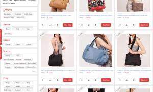
Here are some snapshots..
The main page for navigation is divided vertically below with pictures above relating to that section..does’nt it look a lot like Pinterest ? But I am liking it a lot..visually very appealing..
They have free shipping on all the products and cash on delivery too..and they even have try and buy option in certain areas for certain stuff..and not only that..you see the mobile recharge option..you can do that too on Yebhi..thats cool..
The individual option you select for eg. bags..then you get to shortlist the options on the basis of color, gender, usage, type, price, brand, etc..and all the bags of your choice would be displayed..and no need to search and navigate the whole site..I quite liked this feature..saves a lot of time too..
All the sites have a horizontal format..and I am quite loving this vertical and user friendly, time saving format..quite different. I have shopped previously a few times from Yebhi..and would definitely shop again..
Have you shopped from Yebhi ? Do you like the new site ?




Recent Comments